Doll Blogging Part 4: Themes, Templates & Design
Written on March 21, 2011 at 12:00 pm by MichelleFiled under: Article with tags: doll blogging
Part of the fun of blogging is having a blog that stands out from everyone else’s, so today’s installment of the Doll Blogging mini-series is to go over colours schemes, templates and themes (yes, there is a difference!) and design tips that you can use to make your blog really stand out.
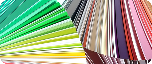
Colour Schemes
One of the most basic colour schemes is to have a white background with black text, I use this on BlytheLife.com. It’s consider basic because many people use it (including many professional websites) and it’s easiest for those who may have visual disabilities to view. Of course, you’re not limited to just using black and white and you can use other colours as well.
A lot of colours go well together. If you take a look at a colour wheel, you can find colours that generally go well together quite easily. Colours that lie opposite of one another are complementary (eg. blue and orange; red and green; yellow and purple/violet), primary colours are red, blue and yellow, secondary colours are violet (purple), green and orange. The colours you pick will reflect on the general feel of your blog and writing. If you customize Blythe to look gothic or dark, you might want to go with a darker colour scheme. If your dolls are constantly wearing cute things with lace and pink, you might want to go with a lighter colour scheme (perhaps pastels?).
It’s important to use colours that are different enough to ensure that your visitors can read the text (what’s the point of them visiting your blog if they can’t read it?). So things to avoid would be any neon colours on a white or black background, a light colour text on an even lighter colour background. You want to make things easy for your visitors to read because you have a very narrow window of opportunity to convince your visitor to stay and read your website – if they can’t read it, they won’t stay and they probably won’t be coming back.

Themes and Templates
Themes and templates are generally interchangeable on some places on the internet, some people think that there’s a difference while others think that the words are pretty much the same thing. And, to be honest, they’re kind of just the same to me!
Themes and templates exist to make the whole layout-designing process a lot easier. For those who aren’t web designing-inclined, you can use a template or a theme to make your blog reflect your personal style without really having to make it all yourself. They are generally precoded layouts and all you really need to do is follow the instructions given by the person who created it.
Most layouts for WordPress are referred to as ‘themes’ while many for Blogger are referred to as ‘templates’, so there may be a small difference in them after all (although not that great). If you have the know-how, you can replace the images used in the precoded layout with an image that you created yourself. However, if you’re not comfortable with touching the coding, I would suggest that you leave it alone or make sure that you save a copy of the original and work off of a copy of the coding (just in case something goes wrong!).
Templates and themes are available in both free and paid versions. Free versions are generally fairly simple, most designers don’t generally offer a lot of technical support with them (and if they do, it’s usually the same information provided to you in a Read Me file, or something like it). Paid versions can range a lot if price. Very basic paid-for layouts may be under $30, but fully customized to your very liking can go up to several hundred dollars (definitely not a cheap option!). However, paid-for layouts will generally get you a lot more technical support.
- Free Blogger Templates
- Blogger Templates
- Free WordPress Themes (from WordPress.org)
- WordPress Themes Base
General Design Tips
No matter if you decide to go with a theme or to tweak a template to your liking, there’s a lot of things beyond that layout that you should consider doing (and not doing!) when creating a website. Things like music, javascripts, flash images, etc.
A lot of people like music and a lot of people like internet. But not everyone likes them together. If you absolutely must have music on your website, you should have controls that are easily visible to the visitor for them to stop it and start it. It should also not automatically play when anyone visits your website. Your visitor may already have music playing or have their volume turned up with no music playing (and not expect to have music suddenly blaring at them). Also, having music auto-play will make your site load slower! And in this day in age where everyone wants faster connections and the information now, they’re not going to want to wait for that.
Javascripts and Flash images are great. They are. They make things pretty, animated, occasionally interactive. They also make your site load slowly. Very slowly. Some people have Javascripts disabled, some people cannot view Flash on their computer. In other words, the majority of the design that you decided to go with for your website cannot load. And what’s the point in that if it’ll take a long time to load and it can’t be properly viewed as you wanted it to be? I’m sure your Javascripts and Flash images look great, but they have a time and place for everything and that place really isn’t your dolly blog (besides, you should be showing off photos of your dolls instead!)
If you haven’t already, be sure to read parts one (The Introduction), two (Names & Hosts) and three (HTML). In two weeks, on April 4, 2011, the conclusion to the mini series, Part 5 (Promoting Your Site), will be posted.
- Part 1: The Introduction
- Part 2: Names & Hosts
- Part 3: HTML
- Part 4: Themes, Templates & Design
- Part 5: Promoting Your Site (April 4, 2011)


 BlytheLife.com opened in July 2010 and is a blog and resource hub for all things Blythe!


Very useful as always ^-^